HSV Palette
The HSV palette uses the HSV colour model, to help improve colour discrimination. It is arranged to simulate two views of the colour cube in 3-dimensional space, but the colours assigned are selected for their usefulness rather than for precision in RGB space.
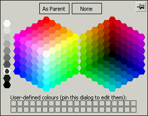
Each half of the main palette consists of 91 colours, and has a distinct arrangement in HSV space, for which purpose it is best to consider each cube as a set of concentric hexagonal rings.
- All colours in the left half of the palette are pure (V=1). The saturation of the colours is stepped in units of 0.2 for each hexagonal ring, ranging from S=1 at the centre to S=0 for the outermost ring. The hues are ordered clockwise.
- All colours in the right half of the palette are saturated (S=1). The purity of the colours is stepped in units of 0.16667 for each hexagonal ring, ranging from V=0 at the centre to V=0.83333 for the outermost ring. The stepping in V-space for this half is different to the stepping in S-space for the left half, since otherwise the outermost rings in each half would contain the same colours (the pure, saturated hues). The hues are ordered anti-clockwise, so as to correspond with the left half of the palette.
A set of ten greys, including white and black is also provided so that there is a total of 192 predefined colours in this palette. It is therefore possible to include an allowance for up to 40 user-defined colours.
 When to use the HSV Palette
You should use the HSV palette under the following circumstances:
- If you wish to define some of your own colours. The Pastel and Artistic palettes also support user-defined colours.
- If you do not have to worry about colour depth issues on the target platforms, for example if you know that the maps will not be deployed in web browsers. Use the Web Safe palette otherwise.
- If you find the colour discrimination of the Web Safe palette too limiting, or if you find the representation as slices through the colour cube somewhat unnatural. The best colour discrimination is obtained using the Artistic palette.
- If you need a wide range of colours of various degrees of saturation and purity. If you need a wide range of pale colours, then consider the Pastel palette.
Copyright © 1998 to by Envitia Group PLC.